Beto Dialer Redesign
In a close race, a pleasant, engaging volunteer experience can mean the difference in winning an election.
The Beto Dialer app is used by campaign volunteers to mobilize voters by tracking their intent to vote and political leaning. I redesigned it as a spec project with the goal to mobilize more voters through a streamlined volunteer experience.
Role: UI/UX designer
Type: Prototyping, Information architecture, UI, UX

I redesigned the process to record canvassing call results for simplicity, accessibility, and delight.
The challenge
Garish colors and a multitude of options shouted for my attention in the current app. Redesign focus:
Adding simplicity to improve scannability
Increasing delight to increase volunteers’ stamina
Results
Through the redesign, I hope to move the needle in elections by making volunteering more engaging, resulting in:
Longer volunteer sessions
More voters reached
Mobilizing more people to get out the vote


Annotated Before & After Screens


High Fidelity Prototype
I solicited feedback from designers as I created the high-fidelity prototype in Sketch and created a clickable version in InVision.
Ideating
I visualized the information architecture to streamline how data was collected, which unearthed the following issues:
- Bloated. Some options were rarely used.
- Redundant. Wordy options were hard to scan.
- Next steps unclear. Information was displayed all at once instead of showing most relevant information.

Wireframing and Prototyping
I played around with a wireframing tool, Balsamiq, to get ideas of how I could arrange elements of the UI and prototype the user flow before jumping into high-fidelity prototyping.
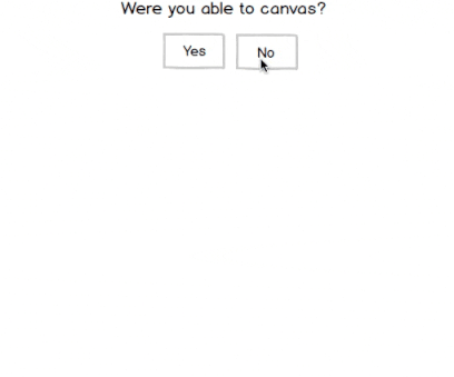
Conditional forms reveal the most relevant options to reduce information overload
Key Learnings
Mapping the information architecture helped me devise a more streamlined flow of information
Iterating on feedback resulted in an easier-to-use prototype
Creating clear calls-to-action helped funnel users through the canvassing process more successfully