+15%
Faster pricing resolution across workflows.
Your Custom Text Here

Outcome + Strategy
By simplifying fragmented pricing workflows at Norwegian Cruise Lines, I reduced dashboard redundancy by 25% and made pricing decisions faster and easier to trust.
In 4 months, I redesigned workflows within tightly coupled systems—prioritizing decision clarity over raw visibility to support real-time pricing actions.
Faster pricing resolution across workflows.
Reduced dashboard redundancy.
Delivered redesign within complex constraints.
Collaboration
Product manager · Lead engineer · 2 UX designers · Data analytics team
My Role
Aligned product, engineering, and analytics teams around shared pricing logic—not dashboard outputs. Simplified fragmented workflows to support faster pricing decisions.
The Challenge
Analysts had data—but no shared way to resolve conflicting pricing signals.
Pricing decisions varied across disconnected systems, making actions slower and harder to trust.
UX Research + Discovery
Analysts compared multiple systems to determine which pricing signal to trust.
“You could get three different answers depending on which screen you looked at first.”
Competing tools created conflicting pricing views.
Analysts compared screens to decide what to trust.
Teams lacked a shared model for resolving conflicting pricing signals.
This shifted the work from organizing screens to modeling decisions.
Logic Diagramming
Before redesigning the interface, I aligned product, engineering, and analytics around how conflicting pricing states should resolve.
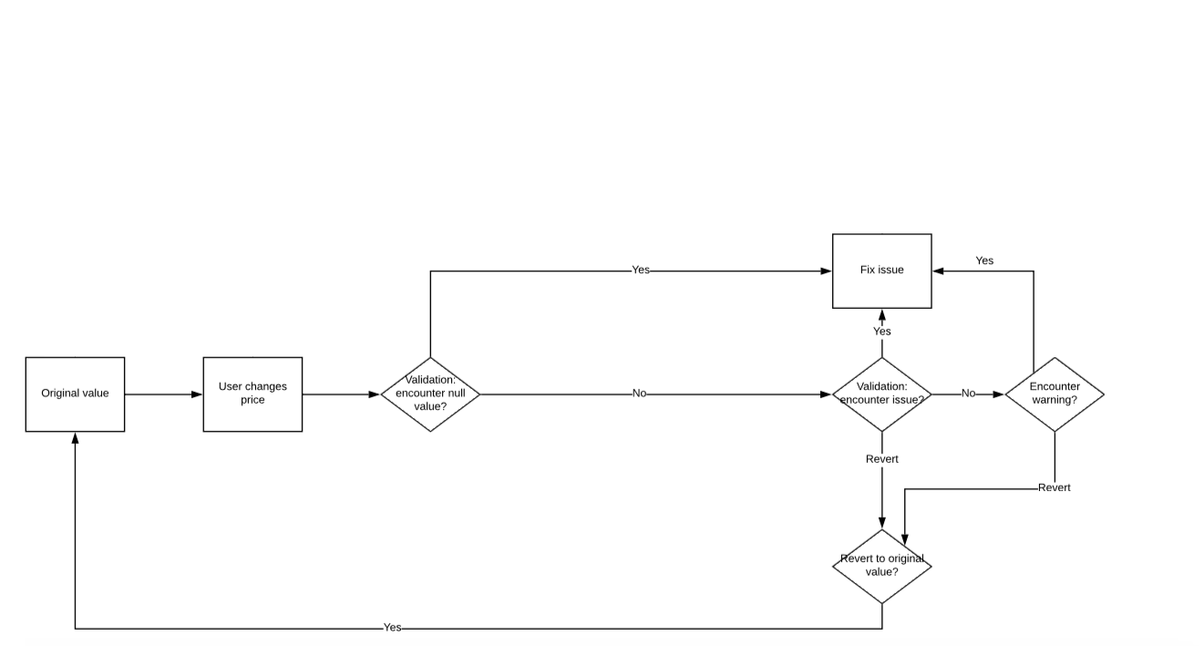
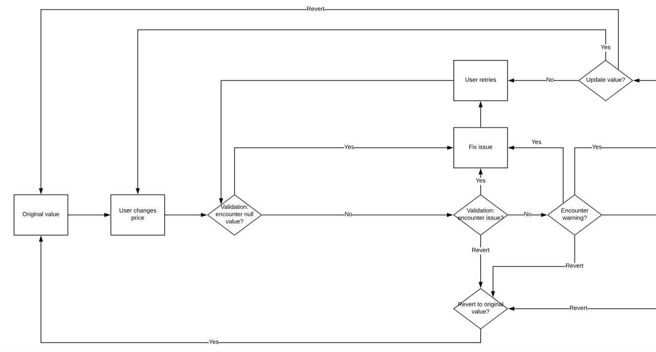
Replaced conflicting pricing interpretations with shared decision logic.
Gave product, engineering, and analytics one model to work from.
Prioritized high-frequency pricing behaviors before edge-case complexity.
Spreadsheet Prototyping
Card sorting and workflow analysis helped identify which signals analysts relied on most.
I used spreadsheet prototypes to test hierarchy, scan patterns, and field prioritization before moving into high-fidelity designs.
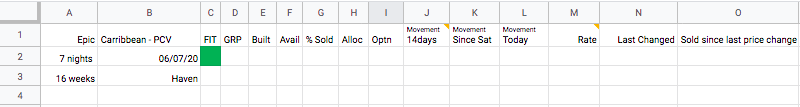
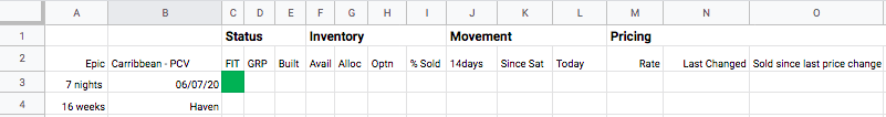
High-frequency signals moved into the first scan zone.
Legacy fields stayed visible to preserve analyst habits.
High-Fidelity Workflow
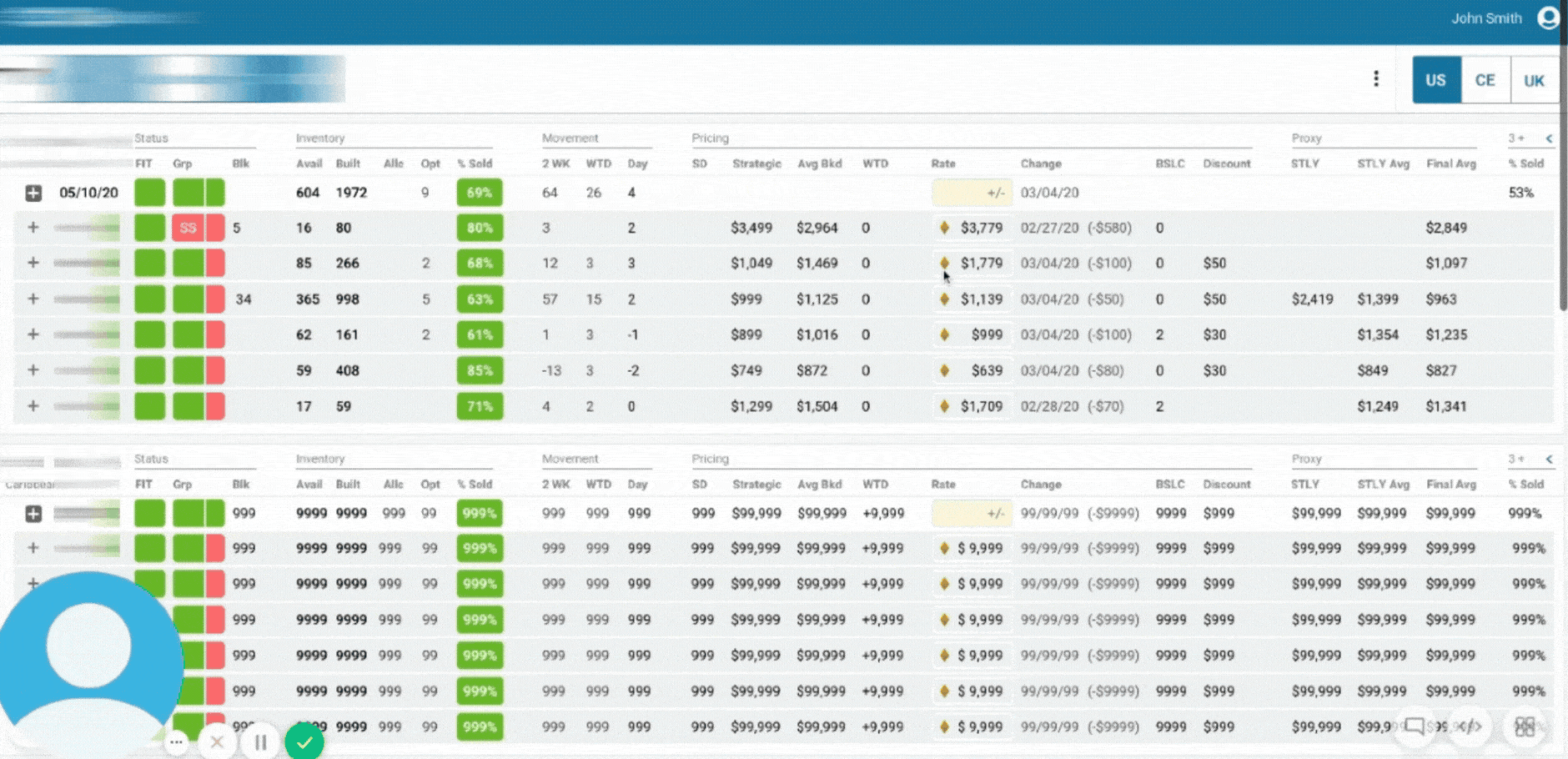
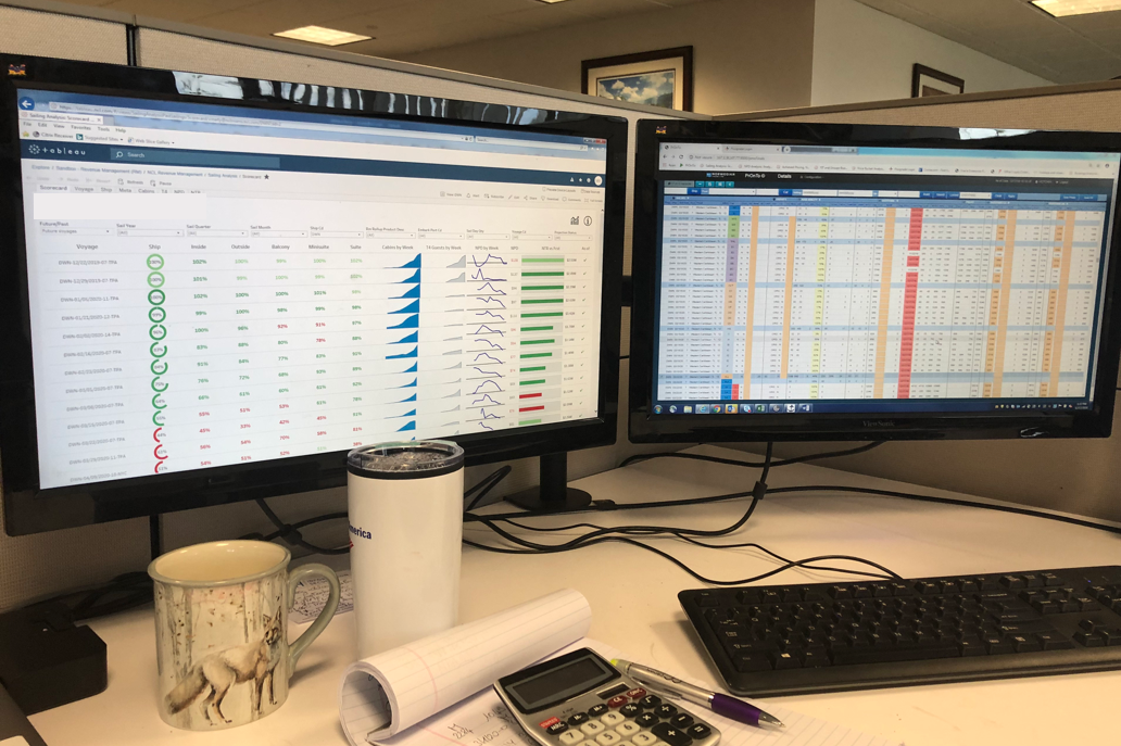
Workflow Fragmentation
Analysts stitched together pricing decisions across disconnected views.
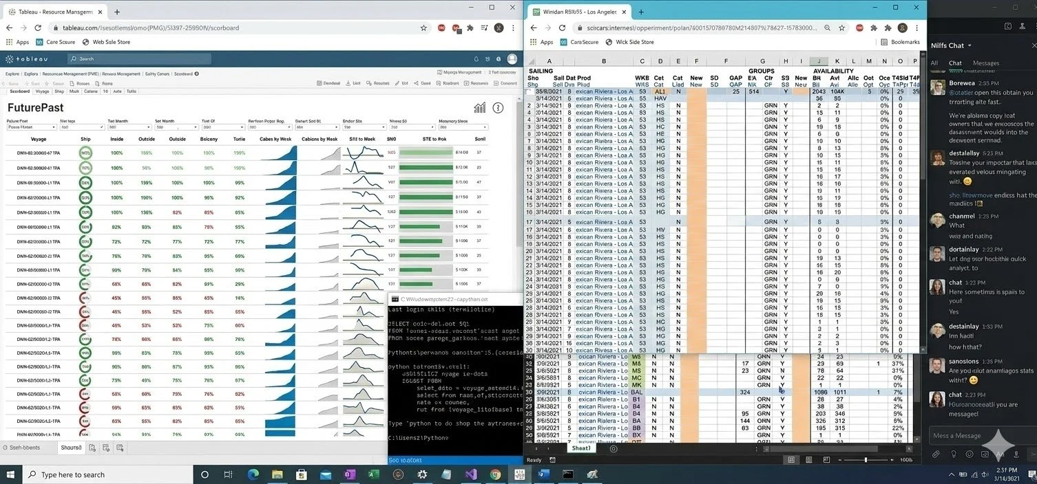
Performance, urgency, and pricing signals lived across separate workflows and spreadsheets.
Outcome
“It’s well designed and pretty intuitive. It incorporates a lot of elements we are used to.”
Analysts previously reconciled pricing signals across fragmented tools.
I redesigned the workflow, unifying high-signal inputs into one experience—making pricing decisions faster, clearer, and easier to learn.
Faster pricing decisions by reducing cross-tool reconciliation.
Analysts rated the workflow highly for supporting pricing decisions.
Easier to learn through familiar patterns and clearer signal hierarchy.
Post-Prototype Testing
Testing showed which pricing signals needed faster visibility—and which regional logic could wait.
Analysts struggled to spot high-risk pricing changes quickly, so 30%+ price shifts were made easier to scan.
EU pricing adjustments were deferred to keep the initial rollout focused and reduce scan complexity.
Reflection
Building the workflow clarified which pricing behaviors mattered most—and which operational assumptions needed to evolve.
Workflow diagrams aligned teams before implementation costs increased.
Focusing earlier on repeated analyst behaviors reduced downstream churn.