30%
Faster task completion across search + booking flow.
Your Custom Text Here

Outcome + Strategy
At Norwegian Cruise Lines, I simplified a legacy booking workflow so travel agents could move faster, learn the system sooner, and support customers with less context-switching.
Rather than rebuilding the system from scratch, I redesigned the workflow within existing legacy constraints to preserve operational continuity.
Faster task completion across search + booking flow.
Travel agents supported through a more learnable workflow.
Designed within legacy constraints without disrupting workflows.
Collaboration
Product manager · Lead engineer · 2 UX designers · Tour operations managers
My Role
Prioritized onboarding speed over feature complexity. Aligned stakeholders around core agent decisions—not feature requests. Led high-fidelity workflow redesign within legacy constraints.
The Challenge + Constraints
How might we cut travel agent training time in half?
Agents compared pricing, availability, and operational constraints across fragmented legacy systems that couldn’t be rebuilt from scratch.
Slow onboarding delayed booking confidence. Live customer calls depended on manual workarounds. Disconnected systems increased comparison time.
Pricing and availability information lived across tabs, tools, and memory.
New functionality had to layer onto existing infrastructure.
Defining the Problem
Previous work prioritized feature breadth over learnability, creating disconnects across the team.
I facilitated a cross-functional workshop to align stakeholders on onboarding goals, operational priorities, and the workflows that would shape the roadmap.
Faster onboarding became the success target.
Lower call times shaped workflow priorities.
Roadmap decisions focused on agent workflows.
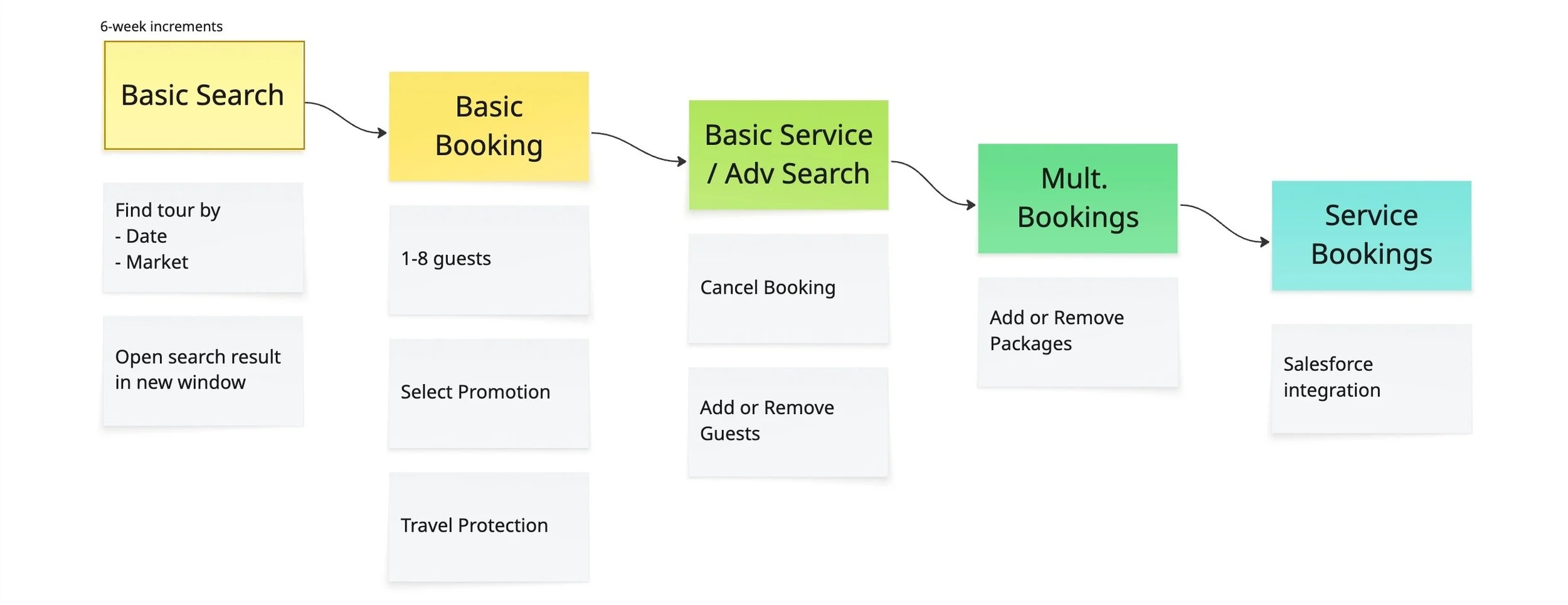
I advocated for a phased rollout centered on search first—reducing onboarding friction while working within legacy platform constraints.
UX Research
Agents switched to the consumer website when internal tools couldn’t answer live-call questions fast enough.
“I’ve lost reservations since people want pictures and I can’t get them right away.”
What happened during live calls
Customer asks for tour details live.
Key information was too hard to access quickly.
The consumer website became the workaround.
Time pressure increased booking risk.
Wireframing & Prototyping
Agents preferred the consumer site over internal tools because it felt easier to learn.
I reused familiar search patterns and layered them onto the legacy workflow—avoiding a full rebuild while unifying search and results.
Agents defaulted to the consumer site instead of internal search tools.
The legacy booking platform couldn’t support a full redesign.
Search was layered onto the existing workflow as an overlay.

Workflow Fragmentation
Agents switched between disconnected systems to search, compare, and evaluate tours during live customer calls.

Agents searched availability in a separate legacy interface.
Switch systems

Pricing and booking details lived in another disconnected workflow.
Agents no longer relied on manual cross-referencing between disconnected systems during live calls.
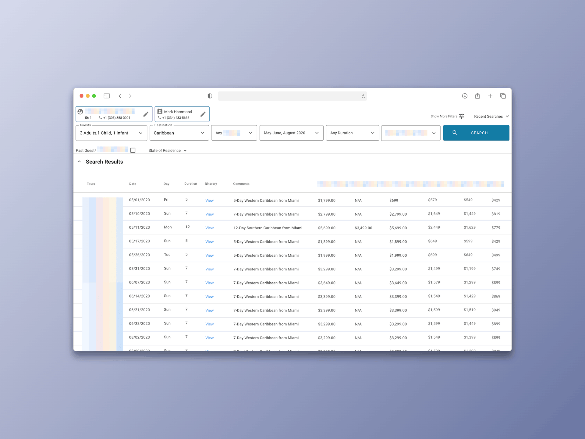
The After
“It’s great. You don’t have to go back and forth and can do everything in one spot.”
Agents previously cross-referenced pricing, availability, and booking details across multiple legacy tools.
I unified search, comparison, and booking into one workflow.
Search and comparison, all in one workflow.
Faster task completion by reducing cross-referencing.
Average ease-of-use rating during usability testing.
Reflection
The project reinforced how much successful workflow design depends on early alignment, validating value before implementation, and reducing learning friction in complex systems.
Defining priorities upfront kept teams focused on outcomes instead of revisiting direction later.
Familiar interaction patterns helped reduce onboarding friction across complex workflows.