Analyst Pricing Dashboard Redesign

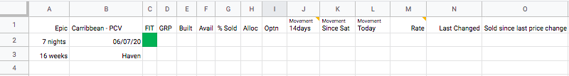
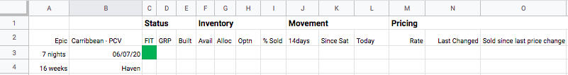
Jess, an Analyst, prints out the pricing table and writes in her price changes to save screen space
Simplifying your design helps the most important pieces shine.
Through user research and card sorting, I cut unnecessary information on analyst’s pricing dashboards by 20% and updated the design to prioritize the most important information for setting prices.
Then, I validated it would be beneficial to users via value testing to confirm that the new dashboard design helped them price effectively.
The Challenge
Role:
UX designer, researching and designed throughout the project and contributing to the design system
Collaborating with UX director, UX designer, and UX researcher
Collaborating with Product Owner and Developers to understand technical and business constraints
For: Company X, a S&P 500 tour company
Type: Rapid High-Fidelity Prototyping, Agile development, User Research, Workshop
Timeline: 4 months
Tour pricing analysts worked across a conglomeration of 4 interfaces when they really needed one place to take pricing action.
Parsing unnecessary and redundant information was confusing and took away analyst’s focus from setting prices effectively.
Results
By the end of the project, we:
Worked with the business and technical teams to create a design that worked within the business goals and technical constraints
Improved the visual hierarchy of the pricing dashboard design while reducing unnecessary fields
Validated we were bringing value to users out of the gate by getting a high-fidelity prototype in front of them, with user ratings averaging 8.8/10 or more
Defining the problem

Analysts were continually flipping between 4 different screens to set prices.
User Observations & Interviews
We went on-site to observe and interview a mix of 9 analysts and managers to make sure we weren’t leaving out any common experiences. I personally participated in half the sessions.
I observed analysts continually shifting back and forth between the interfaces.
One analyst printed out her pricing dashboard, writing down price changes first before updating them in the system to help free up screen space.
Research Findings
In our interviews, analysts expressed wanting to clear feedback on how their pricing was doing. They wanted to know the answers to the following questions:
How well am I selling right now?
What information do I want to see now?
When will I sell out at my current rate of sale?
What should my ideal rate be?
With 4 interfaces they were working with, there was a lot of information that needed to be parsed before setting pricing. One analyst downloaded the data into an additional spreadsheet, adding her own personally-customized calculations.

Doing a card sort helped us prioritize the most frequently used data points.
Card Sorting
I did a card sort with 5 analysts to get an idea of how often they used each data point from the different interfaces.
This helped me prioritize the information that was most important for analysts’ day-to-day and informed the information architecture of the new design.
Prototyping
Low Fidelity
I used a spreadsheet as a low-fidelity prototype to play with the arrangement of the fields and strengthen the visual hierarchy.
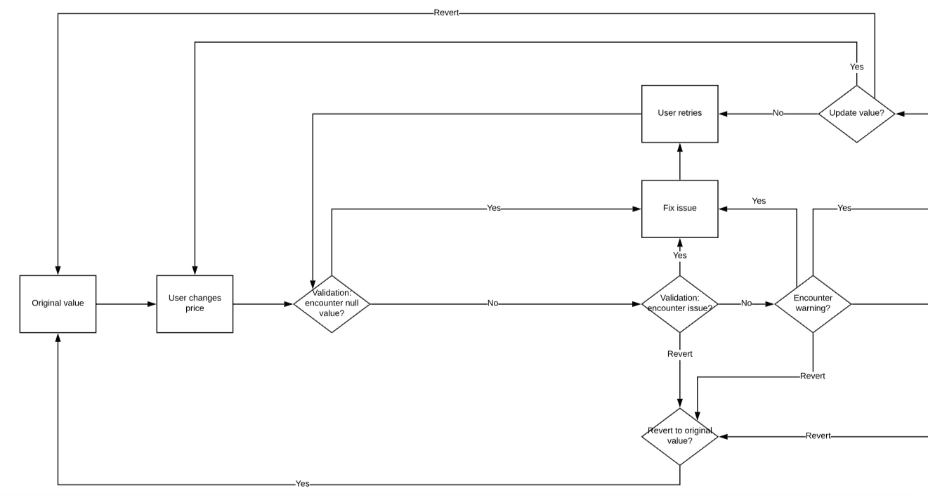
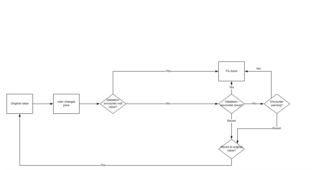
Andy, my manager, took the design and made it high-fidelity, while I worked with the product owner to make sure their validation logic was accurate and reflected in the interactive prototype.
Logic Diagramming
High fidelity
I used Sketch and Invision to create an interactive prototype, working with product owners to source a realistic test scenario and data.
In this prototype, analysts are able to hover over columns to read their descriptions, expand categories for more detail, and make a price change.
User Testing
For testing, our goal was to test the high fidelity interactive prototype and validate we were bringing value to users.
To make sure we weren’t leaving out any questions, I made an exhaustive list for our user researcher John.
John then distilled the script and led think-aloud research sessions live with 8 analysts, including 2 managers.
“It’s very well designed and pretty intuitive. It incorporates a lot of elements we are used to.”
Results
All 8 users responded positively to the new prototype. Their ratings averaged out to the following:
Value: 8.8/10
Ease of use: 9.2/10

Synthesizing Research
I led the synthesis from our 8 testing sessions through affinity mapping and creating a presentation to share findings with stakeholders.
We are currently:
Working with the developers to ensure the design is implemented successfully
Aligning with stakeholders on which feedback to integrate into the next sprint
Key Learnings
Working closely with the tech team to visualize the logic ensured the dashboard worked they way analysts expected
Keeping the design system up-to-date was key in keeping interactions consistent across our projects
Synthesizing the research properly helped us portray insights that were true to our user tests