
Faster task completion across search and booking flows
Faster Tour Search: Designing for Learnability
The Outcome
Simplified a legacy booking workflow so agents could move faster, learn the system sooner,
and support customers with less context-switching.
Agents supported through a clearer, more learnable experience
Designed within legacy constraints without disrupting agent workflows
The Approach
Defining success across teams—speed and trainability
Prior work had optimized for features, not learnability. I facilitated a workshop to align on both.Reframing search as a decision-making system
I led the design of a unified workflow that brought key booking criteria into one place.Proving value before committing to build
Validated with agents that the new flow improved speed and confidence (Rated 9/10).
My Role
Aligned product and business stakeholders on core agent decisions—not features
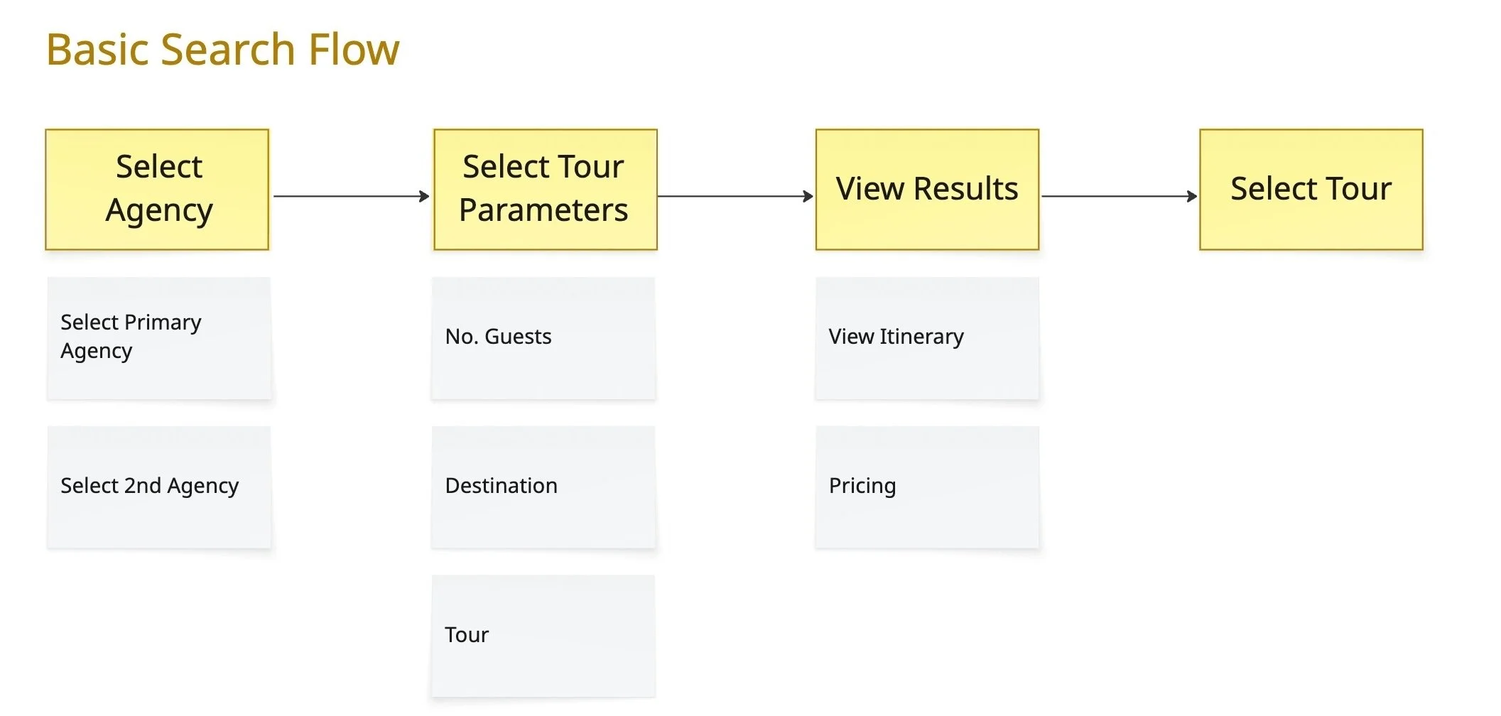
Defined a decision model for booking tours alongside engineering: Find → Compare → Evaluate
Set learnability as a constraint, prioritizing onboarding speed over completeness by co-creating the roadmap with stakeholders
Led high-fidelity design execution and partnered with another designer on research and testing facilitation.
The Challenge
How might we cut travel agent's training time in half?
Four weeks to onboard was too long. The goal: cut it to two without sacrificing accuracy or speed.
Agents had to evaluate tours across pricing, availability, and constraints—but the system worked against them.
Where the system broke
| UI / Workflow Issues | Underlying System Constraints |
|---|---|
| Critical data was buried or hard to access | Legacy system couldn’t be replaced—new functionality had to layer on top |
| Decisions required manual cross-referencing | Search and comparison were split: no shared workflow |
The costs
Missed opportunities, lower conversion, and longer training times to navigate the system.

Stakeholder votes on most important goals and functionality
Defining the Problem
What wasn’t working
Past work was misaligned on both outcomes and target users.
I led a cross-functional workshop where stakeholders voted on success metrics and core personas—aligning on who we were designing for before defining solutions.
Success metrics:
Reducing training time by 50%
Reducing call time by 30%
Reducing travel partner call center reliance
Our core user became tour agents—over outbound sales and third-party agents—sharpening scope for the roadmap.
Onboarding time + benefit to tour agents became the force function to resolve competing stakeholder priorities.
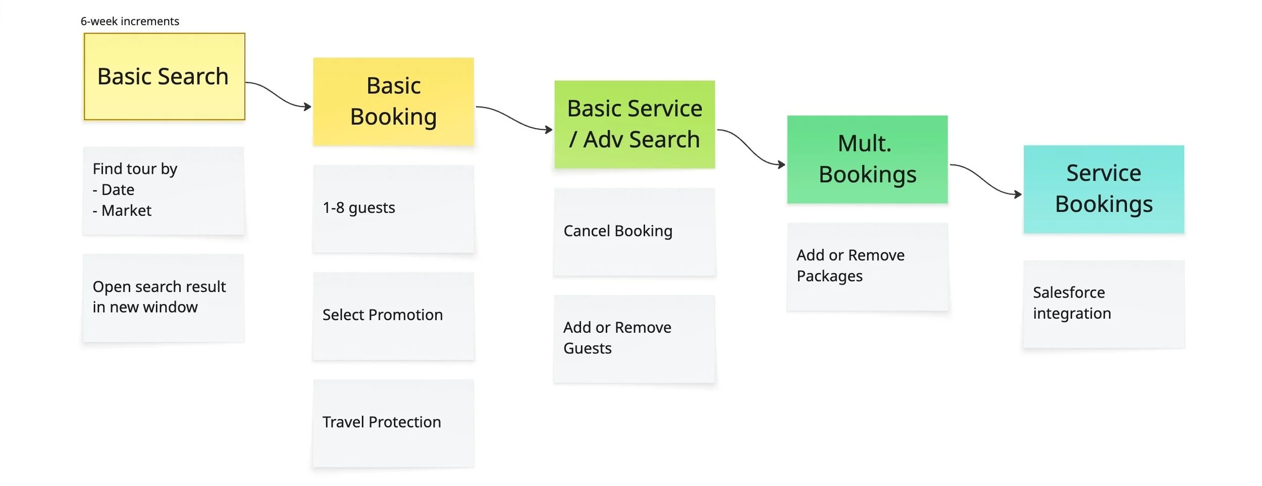
Roadmapping: Building the System in Learnable Stages
I synthesized workshop outcomes into a shared roadmap across product, engineering, and business.
Product pushed for advanced filtering upfront, but I prioritized time to first booking over configurability to optimize onboarding speed.
I advocated that we lead with search: a familiar entry point that lowered training burden, especially as agents were defaulting to the consumer site.
Staging approach
- Search first → establish a clear entry point
- Booking + Service next → naturally extend the flow
- Advanced features last → add complexity intentionally
I prioritized a sequenced decision model—trading flexibility for faster, more confident decisions under time pressure.
This flow optimized learnability, reducing training complexity while we built toward a unified system.
Key Tradeoffs
Prioritized decision speed over full configurability
Focused on a clear search entry point instead of exposing all filtering logic upfront.Leveraged existing mental models over introducing new ones
Aligned search with the consumer experience agents were already using.Reduced initial scope to improve learnability
Deferred advanced features until the core workflow was established.
UX Research
Research Findings: Too Little, Too Late
"I’ve lost so many reservations since people want pictures and I can’t get them right away."
Talking with agents revealed pain points:
Key information not accessibile during live calls → low customer confidence and missed bookings
Workflows didn’t support real-time decisions → reliance on memory and workarounds
Information spread across 5 sources → time pressure doing manual synthesis across agent tools, website + printouts
Wireframing & Prototyping
Designing for familiarity
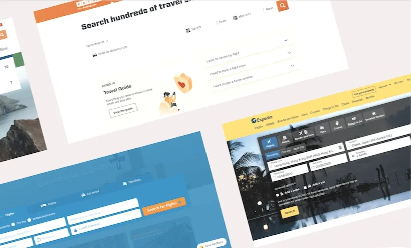
Agents often relied on the consumer website to search because it was more intuitive than internal tools.
The new design leveraged existing patterns from the website to reduce the need to relearn how to search.
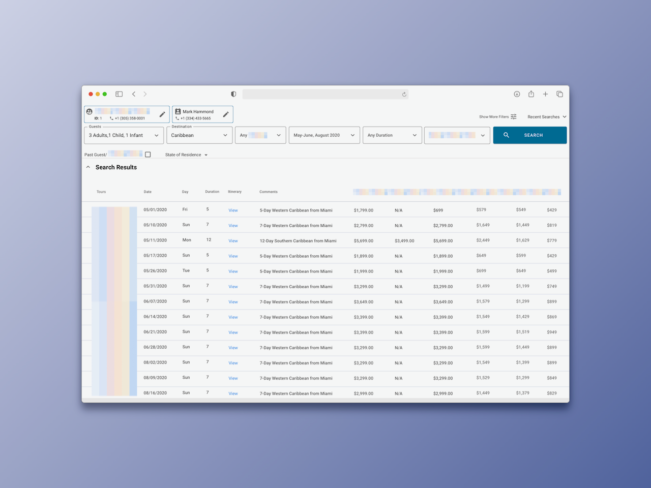
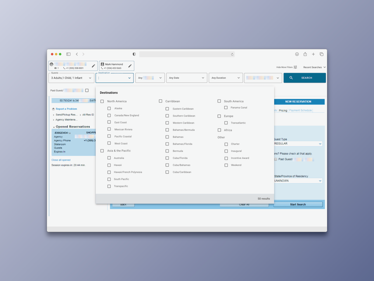
The After: Search + Results in One Place
The search bar is now layered on top of the legacy interface as an overlay—creating a unified entry point without restructuring the system.
I negotiated with engineering to land on this approach given the constraints—trading a full UI overhaul for a faster, lower-risk path to unify search and results.
This enabled:
Search + comparison in one place
Continuity & integration with existing workflows
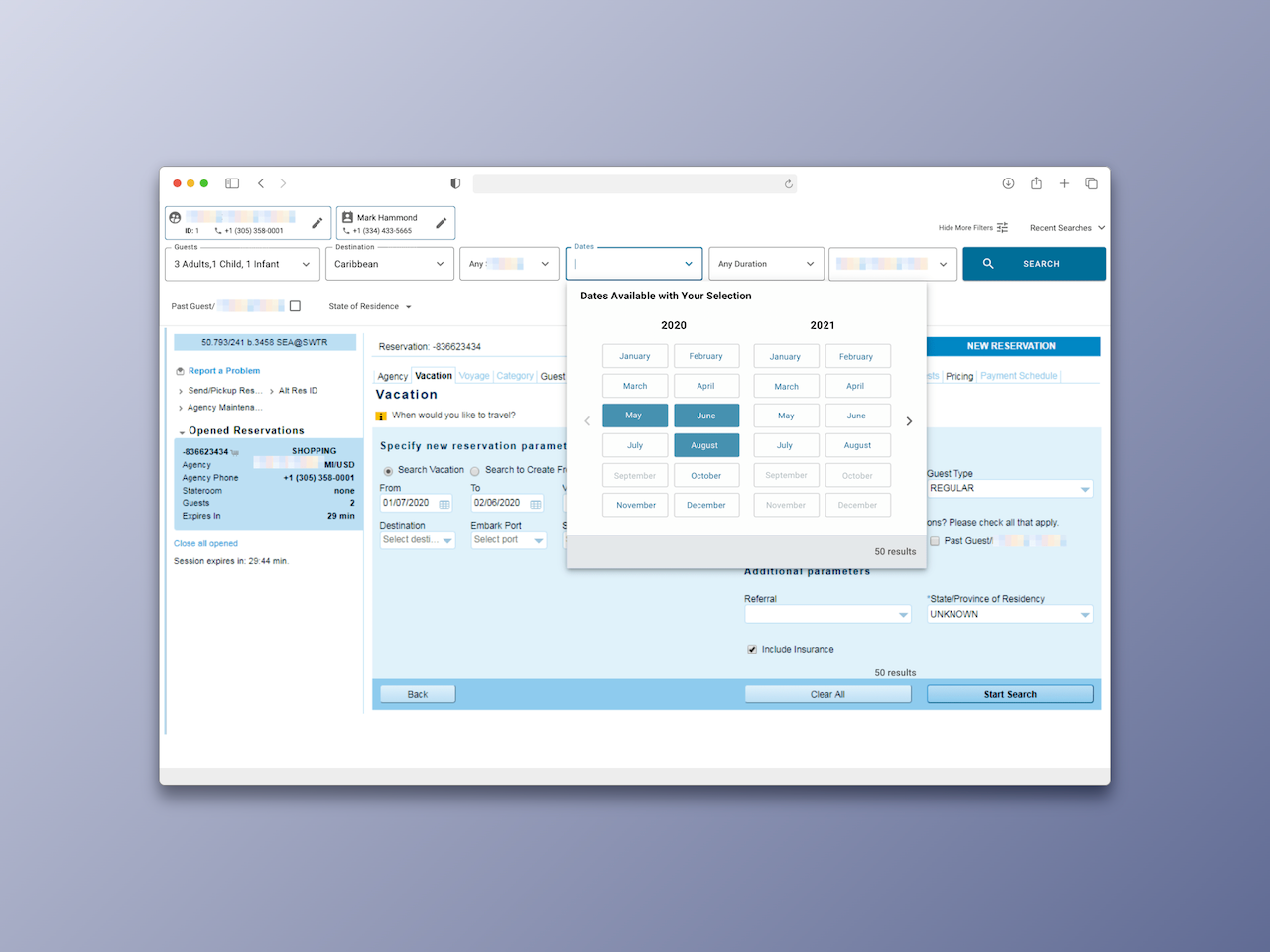
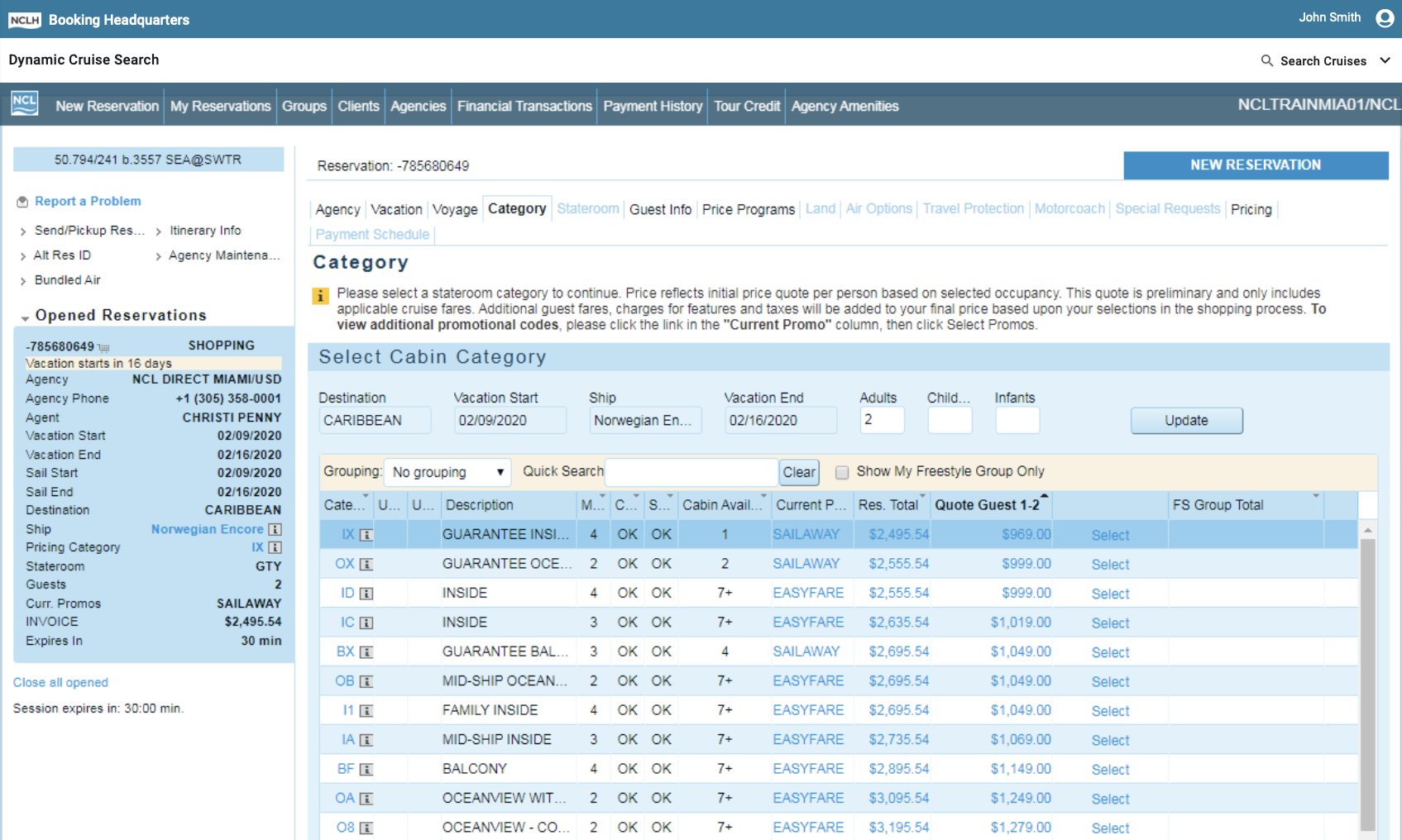
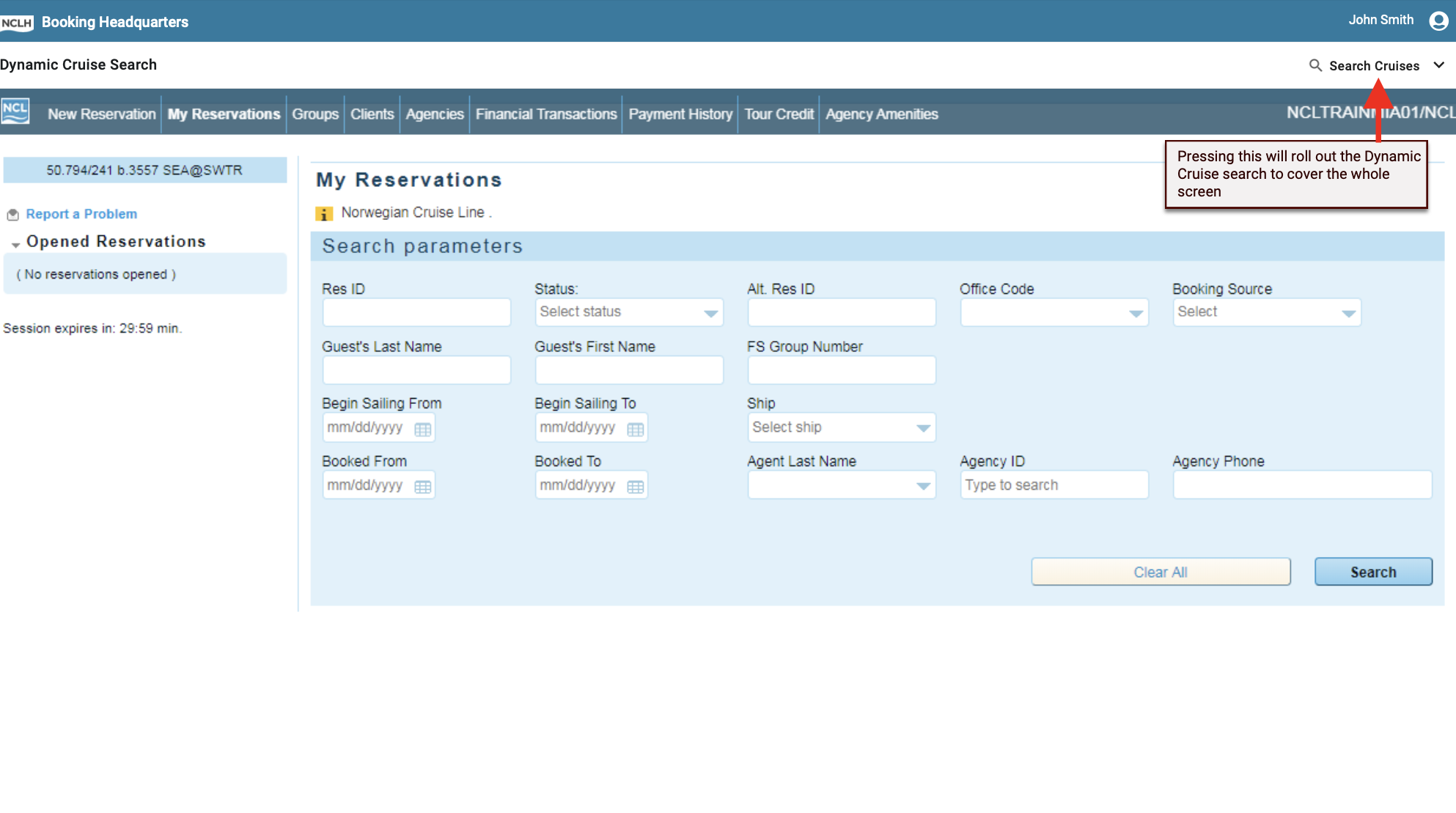
The Before: Search + Results Separated
Agents had to switch contexts to compare and evaluate tours.
Now, they’re in a single interface—enabling agents to search, compare, and decide without breaking flow.
The Result
"It’s great. You don’t have to go back and forth and can do everything in one spot."
Agents could find and evaluate tours in one place, reducing tool-switching and making the workflow easier to learn.
Compare → Drill-down
finding and comparing tours now in one flow
via eliminating cross-referencing
average ease-of-use rating in tests
Key Reflections
Aligning on shared goals early prevents rework down the line, keeping teams focused on outcomes
Validating value before build reduces risk and ensures solutions actually improve real workflows
Designing for learnability is critical in training-heavy environments